


The Problem
You have a container with a fixed width and text that might be too long to fit. The classic solution is text-overflow: ellipsis, but that permanently hides the overflowing content. What if you want users to see the full text, like Spotify does with long track names and artist lists?
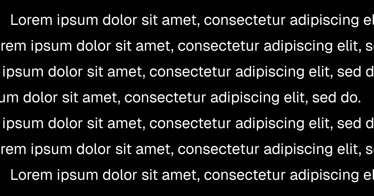
The goal: a marquee that scrolls text back and forth only when it overflows, and does nothing when it fits. No JavaScript, no client components. Pure CSS.
The Core Trick
The entire approach hinges on one CSS expression:
transform: translateX(min(0px, 100cqw - 100%));Here's why this works:
100cqwis the container's width (via CSS container queries)100%in atransformresolves to the element's own width- When the text fits:
100cqw - 100%is0or positive, somin(0px, ...)evaluates to0. No movement. - When the text overflows:
100cqw - 100%is negative (e.g.,-120px), somin(0px, -120px)evaluates to-120px. The element shifts left by exactly the overflow amount.
A single animation handles both cases. Text that fits stays perfectly still. Text that overflows scrolls to reveal the rest.
CSS Implementation
The Keyframes
@keyframes marquee-scroll {
  0%,
  10% {
    transform: translateX(0);
  }
  90%,
  100% {
    transform: translateX(min(0px, 100cqw - 100%));
  }
}
The 0%, 10% and 90%, 100% create a brief pause at each end before the animation reverses direction. This gives users a moment to read the text at both positions.
The Styles
.marquee {
  container-type: inline-size;
  overflow: hidden;
}

.marquee-inner {
  display: inline-block;
  min-width: 100%;
  white-space: nowrap;
  animation: marquee-scroll 12s linear infinite alternate;
}

@media (prefers-reduced-motion: reduce) {
  .marquee-inner {
    animation: none;
  }
}
There are three key properties on the inner element:
display: inline-block: lets the element grow wider than its parent based on contentmin-width: 100%: ensures short text still fills the container (so100cqw - 100%evaluates to exactly0)white-space: nowrap: prevents text from wrapping to a new line
The animation: ... alternate makes the animation bounce back and forth instead of looping. Combined with the pauses in the keyframes, the text scrolls to the end, pauses, scrolls back to the start, pauses, and repeats.
The HTML
<div class="marquee">
  <div class="marquee-inner">
    This is a really long text that will scroll back and forth
  </div>
</div>
That's it. No data attributes, no JavaScript measurements, no resize observers.
Here's a live example. Notice how the short text stays still while the long text scrolls:
Short text (no scrolling):
Long text (scrolls back and forth):
Lorem ipsum dolor sit amet, consectetur adipiscing elit, sed do eiusmod tempor incididunt ut labore et dolore magna aliqua. Ut enim ad minim veniam, quis nostrud exercitation ullamco laboris nisi ut aliquip ex ea commodo consequat.
Tailwind CSS Implementation
In Tailwind v4, @container sets container-type: inline-size. Combined with arbitrary animation values, we can skip the CSS classes entirely (except the keyframes).
The Keyframes
You still need the keyframes defined in your CSS file since Tailwind can't generate @keyframes declarations inline:
@keyframes marquee-scroll {
  0%,
  10% {
    transform: translateX(0);
  }
  90%,
  100% {
    transform: translateX(min(0px, 100cqw - 100%));
  }
}
The Component
export function Marquee({
  children,
  className,
}: {
  children: React.ReactNode;
  className?: string;
}) {
  return (
    <div className={`@container overflow-hidden ${className}`}>
      <div className="inline-block min-w-full whitespace-nowrap motion-safe:animate-[marquee-scroll_12s_linear_infinite_alternate] motion-reduce:animate-none">
        {children}
      </div>
    </div>
  );
}
Tuning the Animation
You can adjust the behavior by changing a few values:
- Duration (
12s): Longer = slower scroll. Shorter = faster. Adjust based on the typical amount of overflow - Pause duration (
10%/90%): Increase for longer pauses at each end (e.g.,20%/80%) - Easing (
linear): Useease-in-outfor a softer start/stop feel
Conclusion
The min(0px, 100cqw - 100%) pattern is the key insight that makes this work. It lets a single CSS animation handle both overflowing and non-overflowing text without any JavaScript measurement. The container query unit (cqw) gives us the container's width from the child's perspective, and 100% in a transform gives us the element's own width — comparing the two tells us exactly how far to scroll.